Atrium Café Portsmouth
Branding, identity, design, and photography for an office complex eatery in Portsmouth. Formerly The Real Cooking Café, The Atrium Café is a bright, airy, inviting eatery sited in the lobby of the Lakeside 1000 office complex. I proposed the ‘Atrium’ name for its open, welcoming feel, then pursued a ‘leafy’ motif to suit the restaurant’s organic offering.
Concept 1
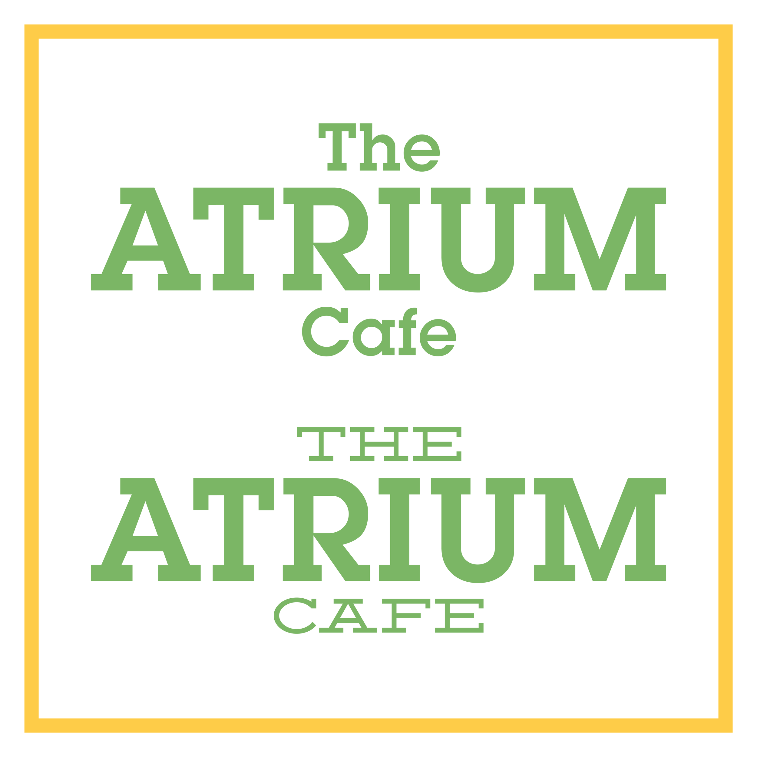
Okay, so, leaves. Color? Green. Done. I started out with a slab typeface — always a good way to get a feel for the letters — and that was it. Logo concept numero uno.
Concept 2
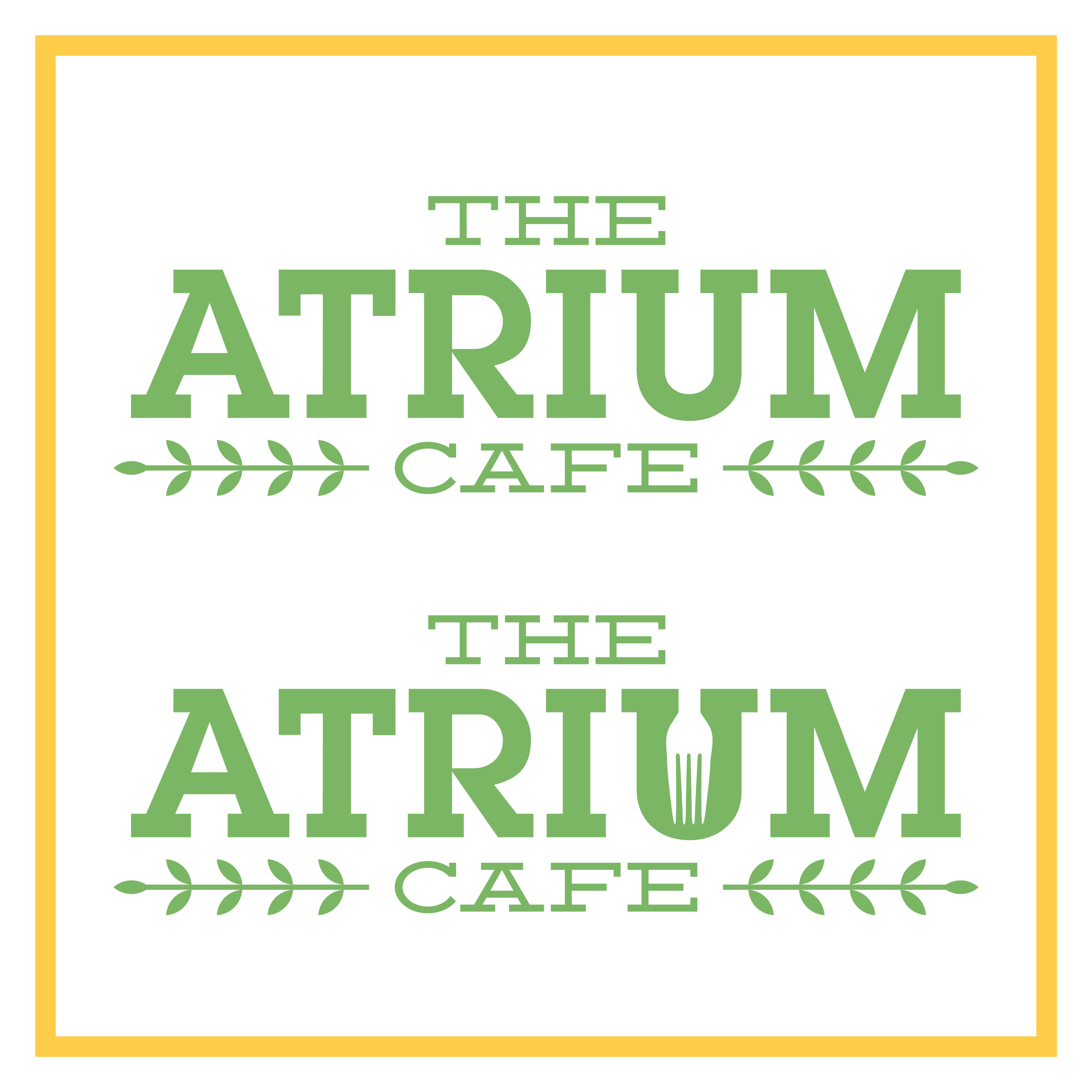
Nope, green isn't enough. Need to throw some actual leaves in there so people know it's the real deal. And, woah, what if I stabbed a fork through the ‘U’? Negative space is the best.
Concept 3
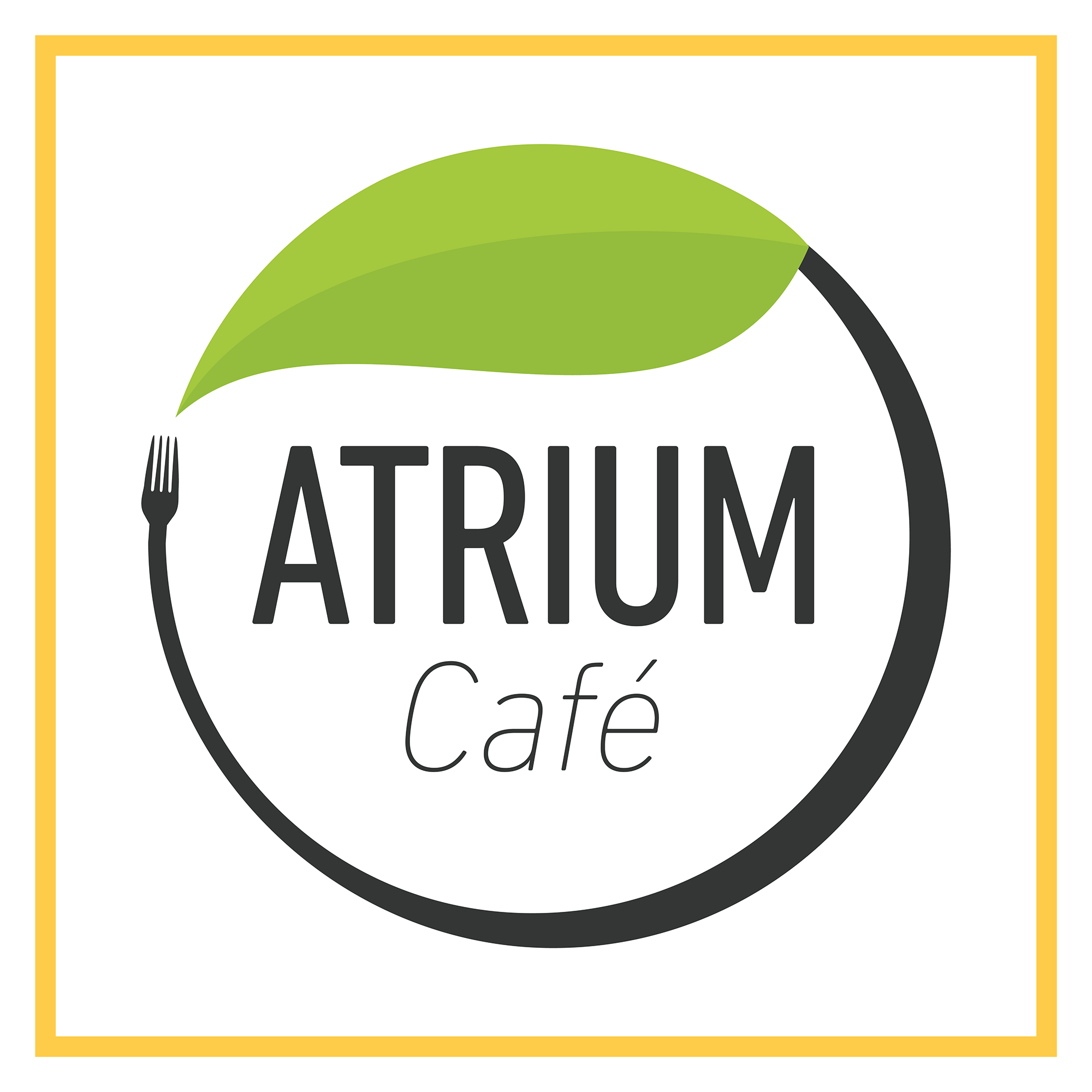
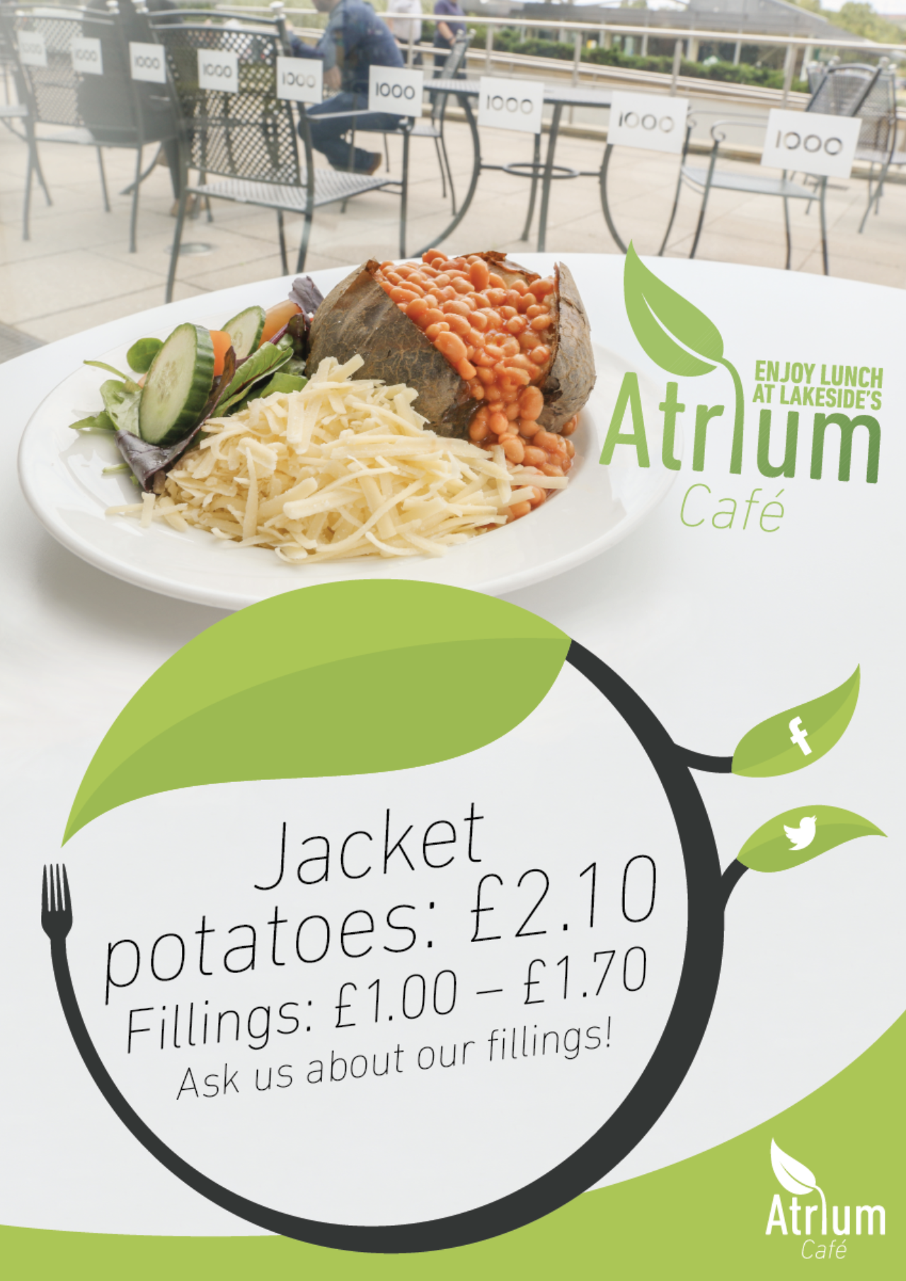
What if I threw the leaf and fork motif around the logo in a neat little circle? Works nicely. Didn't use as a logo, but reused this lock-in on packaging and posters!
Final Logo
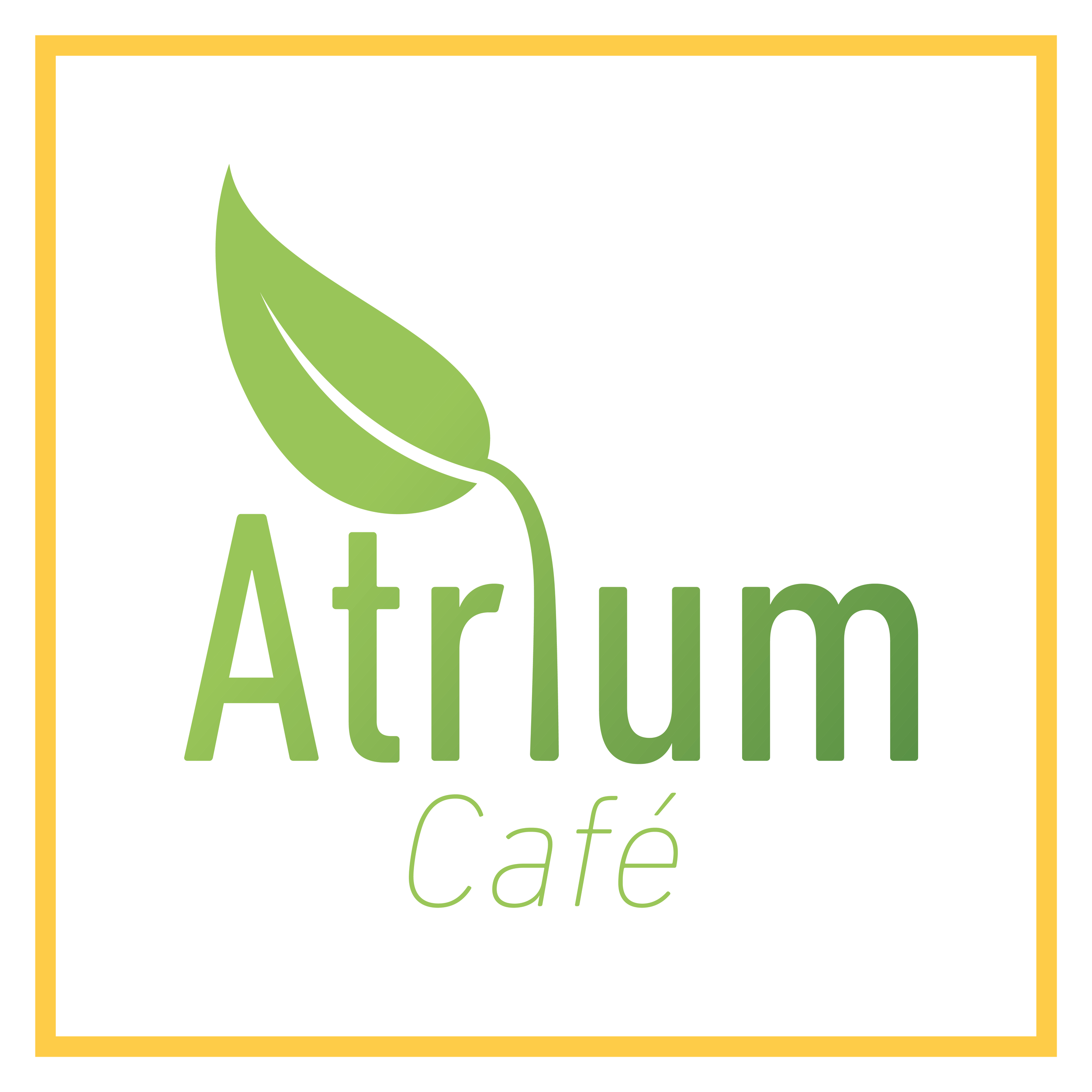
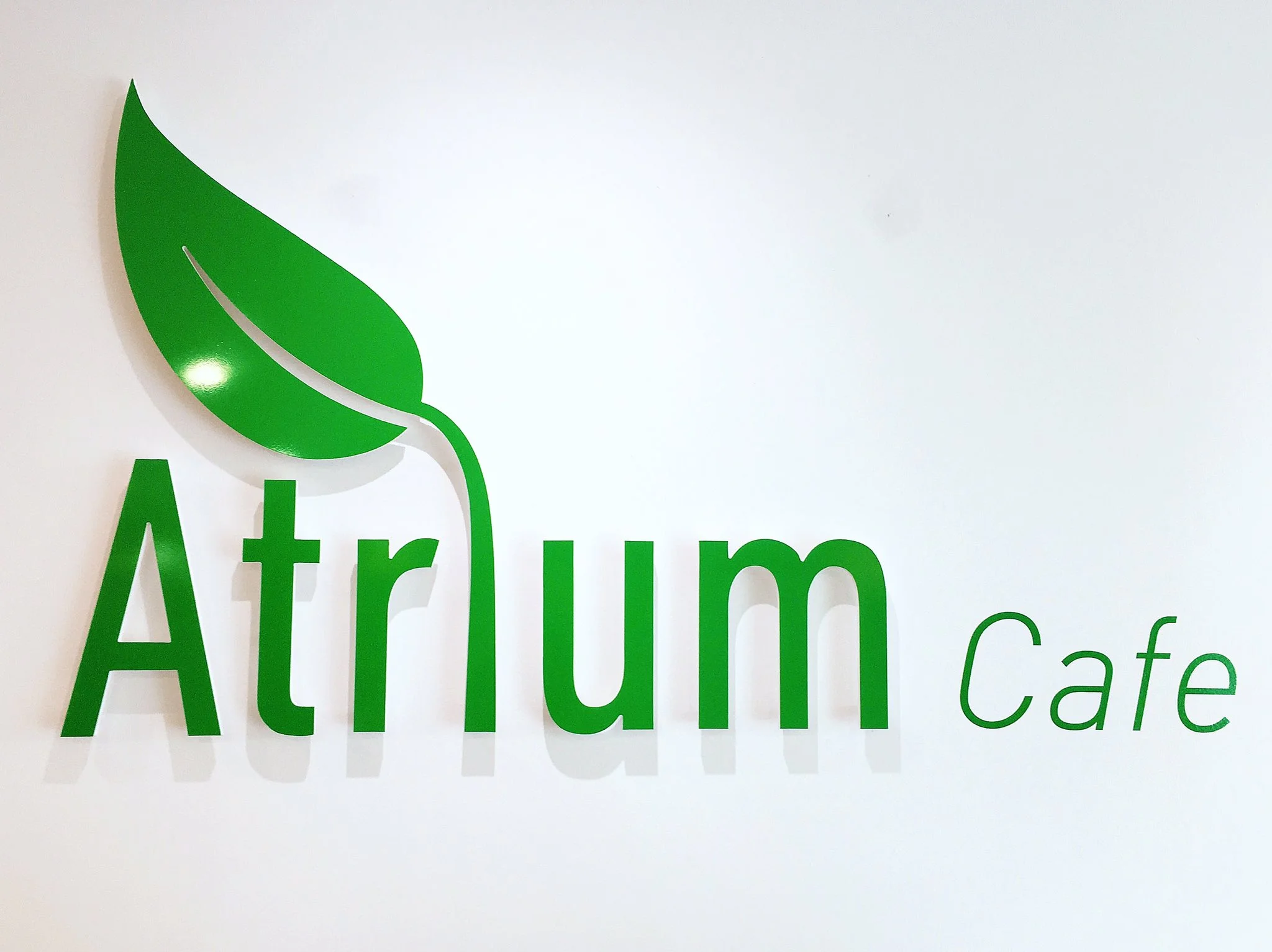
I ultimately abandoned the fork. Felt like too much. The leaf became the central decoration of this, the final logo — so much so that it became one of the characters. Done!
Print & Photography
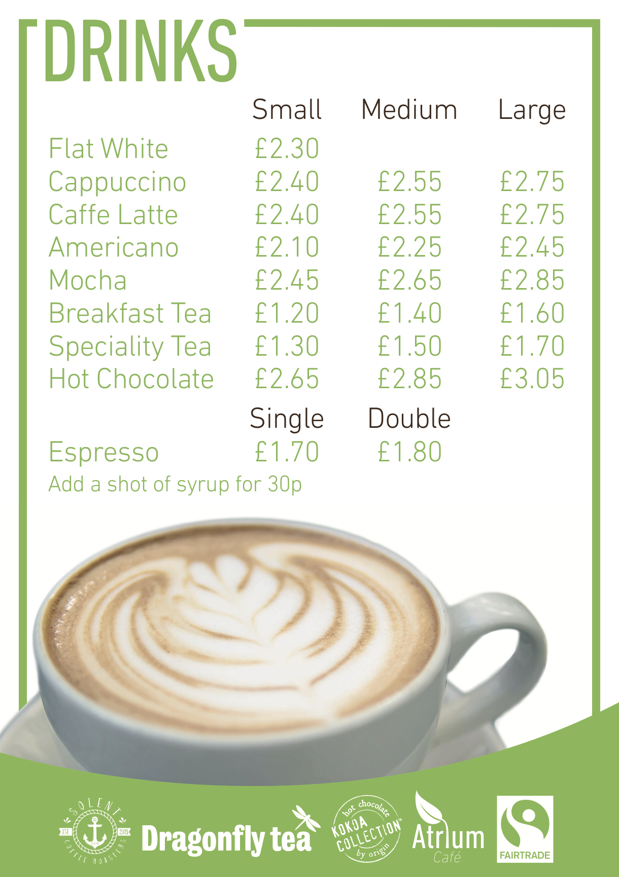
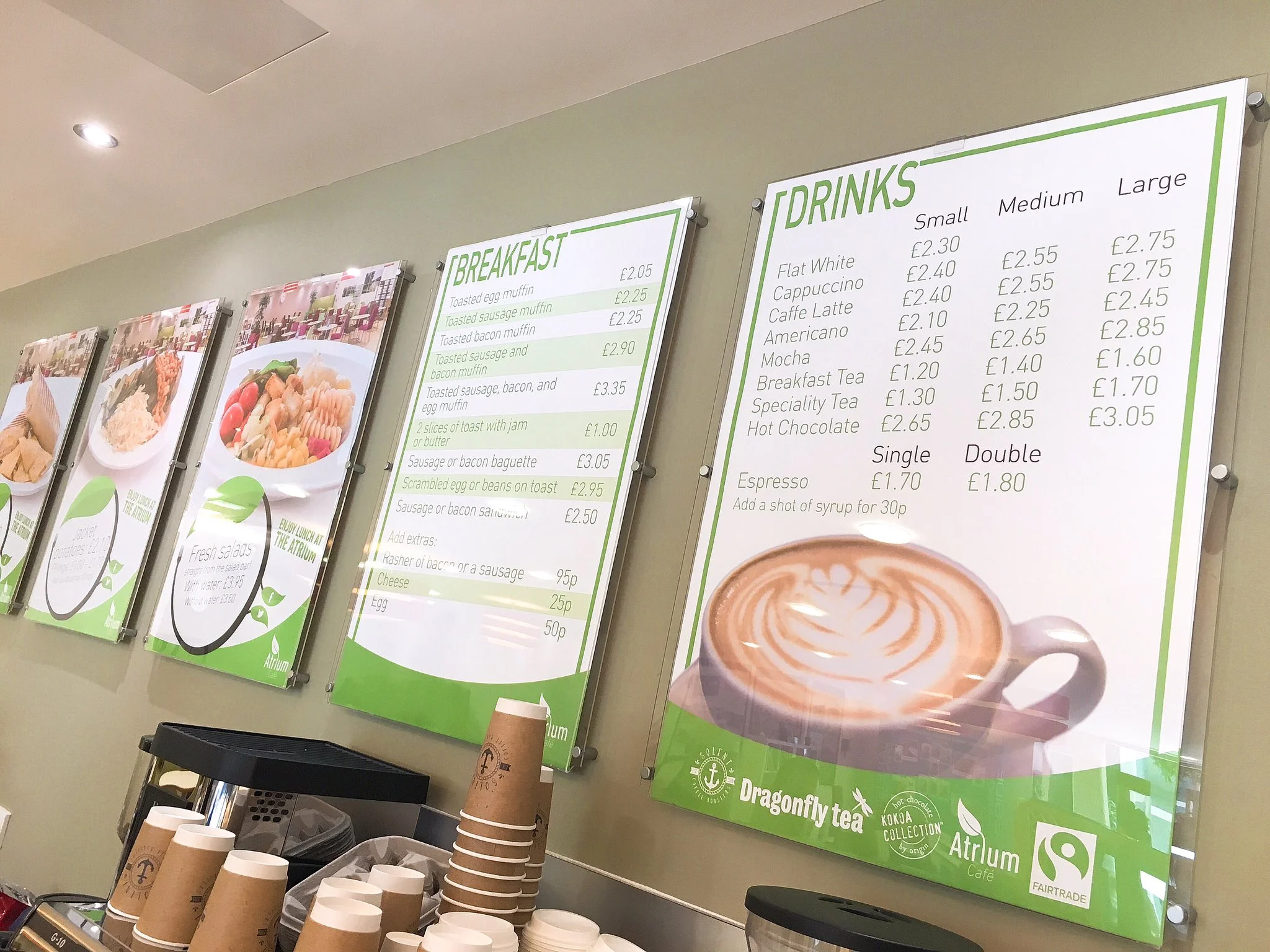
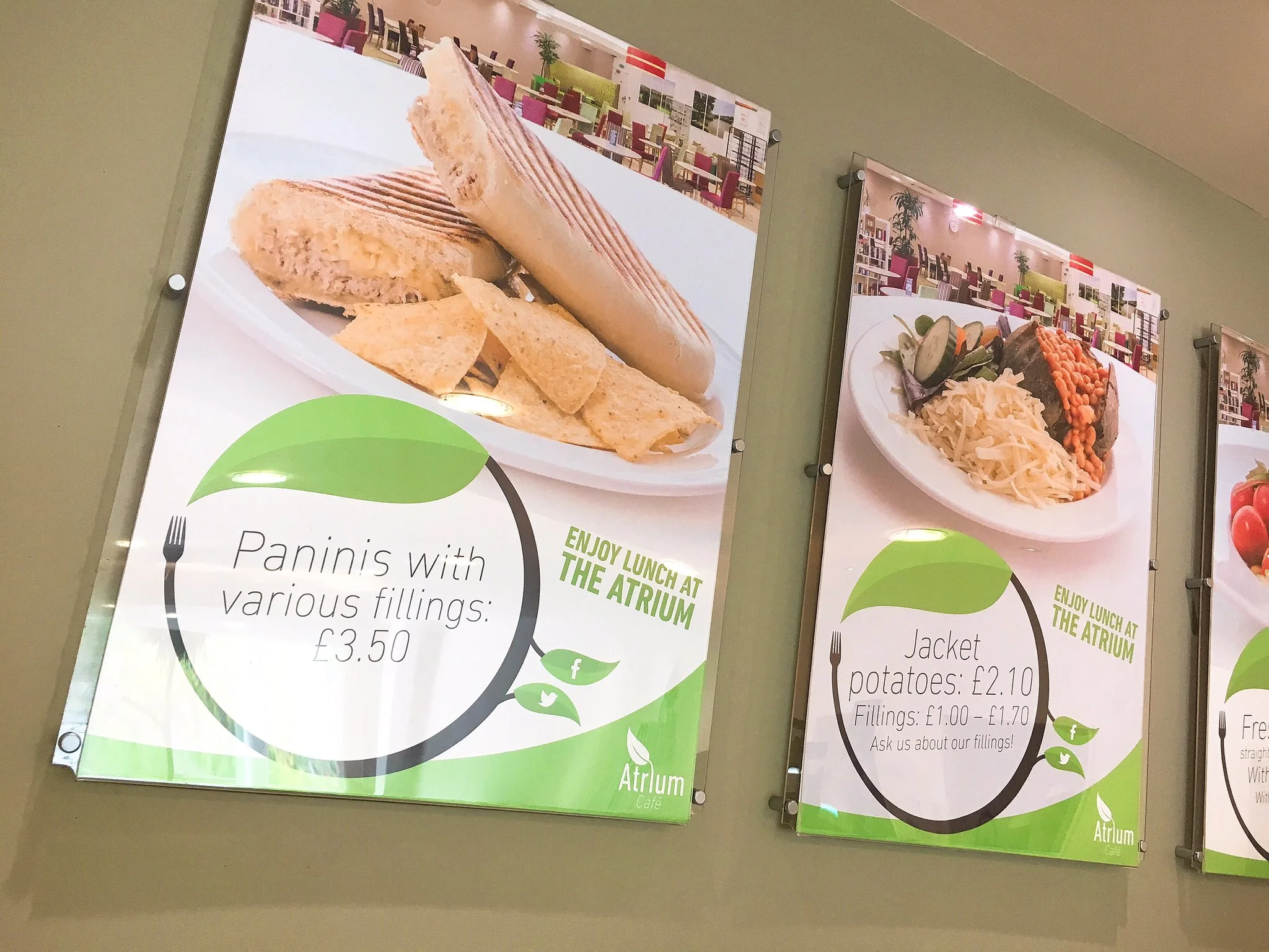
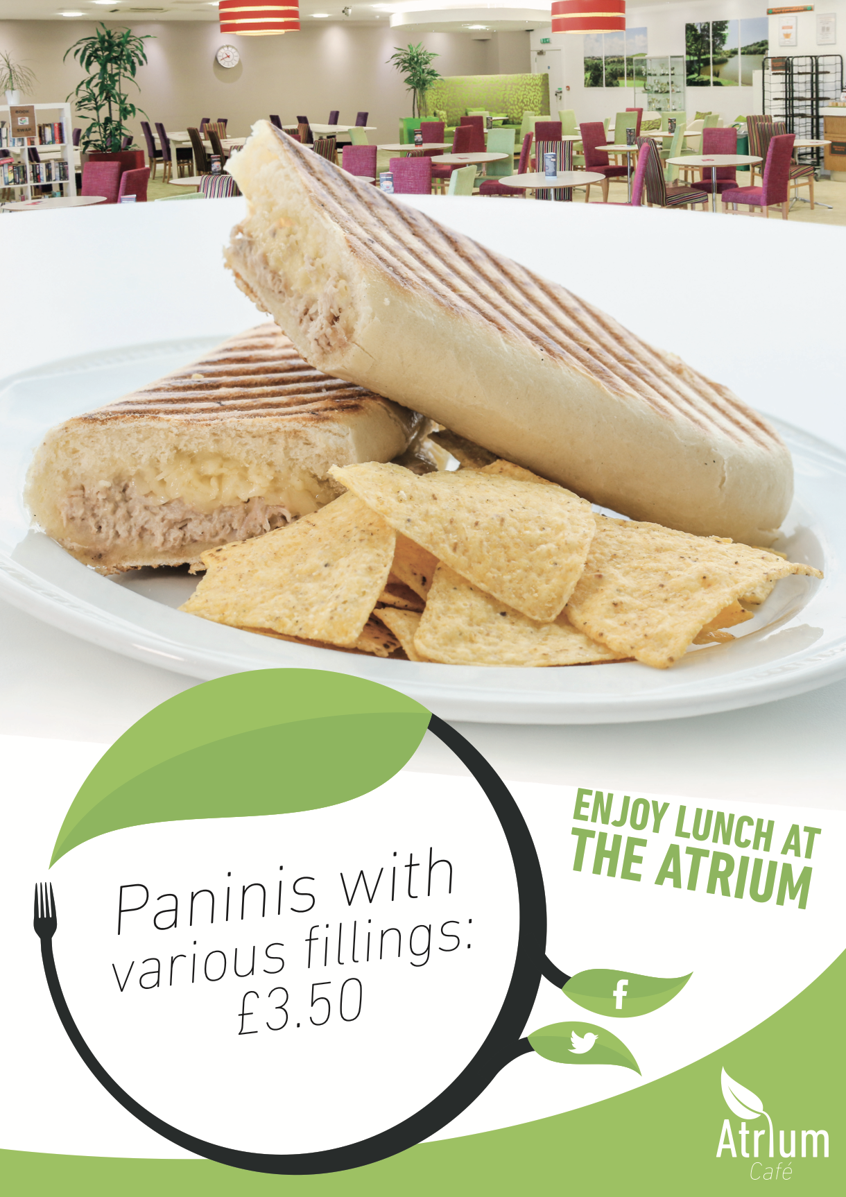
Behind the Scenes
Career highlight
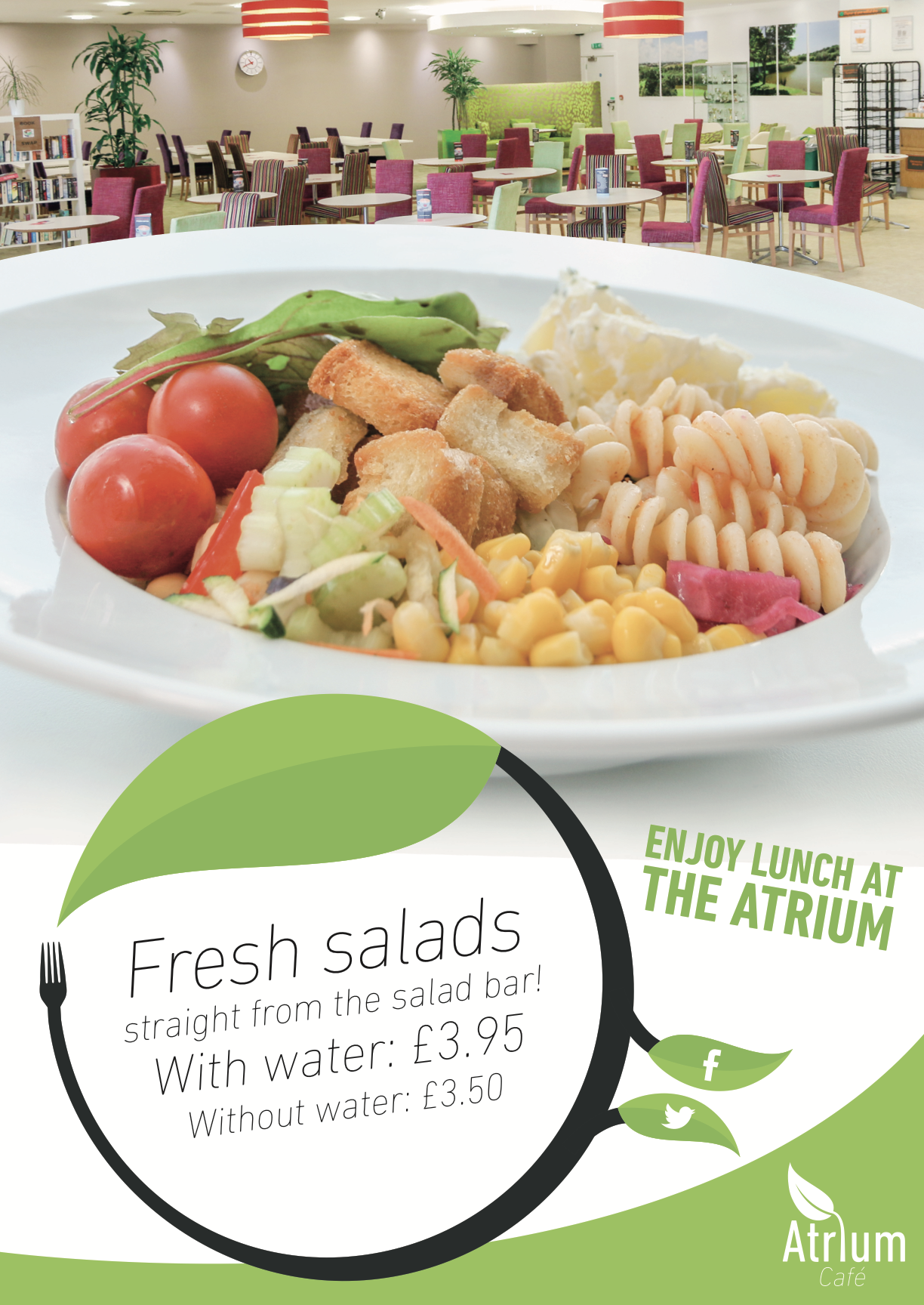
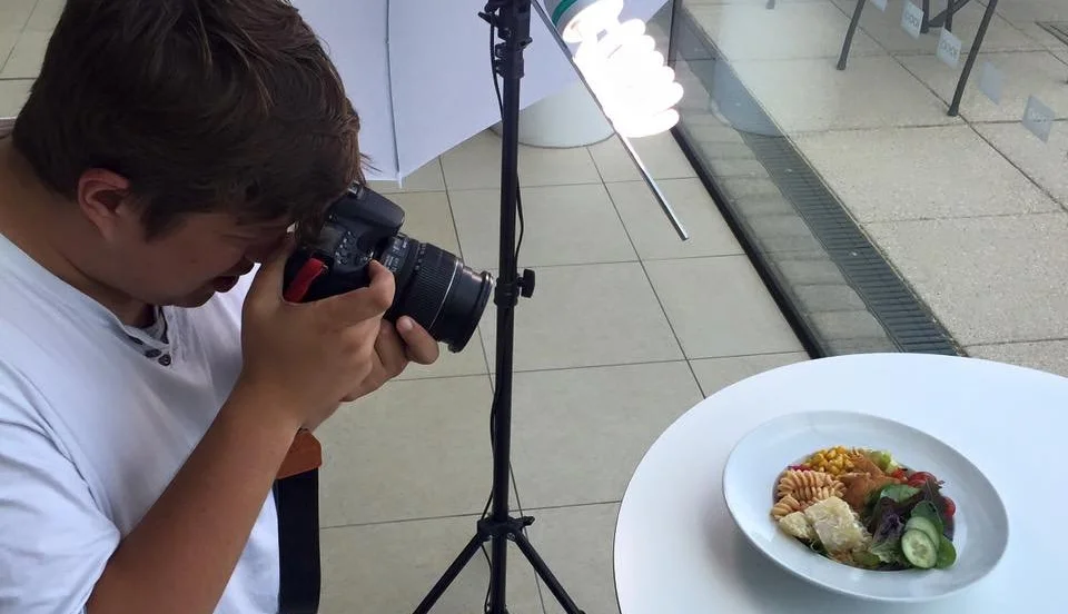
Photographing and retouching pictures of salads was a definite peak in my career, and I’m afraid it’ll never get this good again.
One more thing
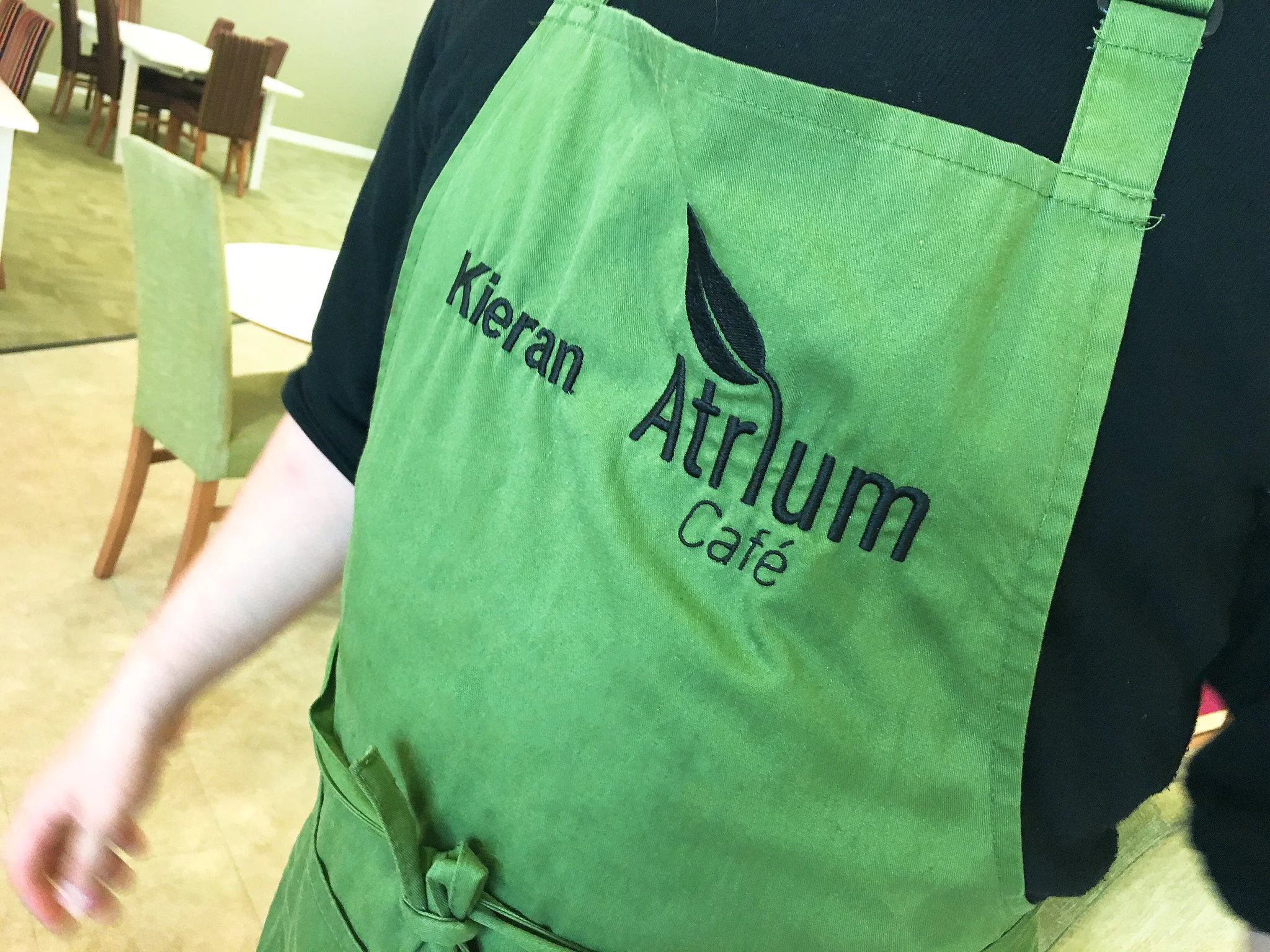
Shoutout to Kieran for letting me take a photo of his embroidered apron while he was keeping busy dishing up orders.